• Please make sure you are familiar with the forum rules. You can find them here: https://forums.tripwireinteractive.com/index.php?threads/forum-rules.2334636/

Mare Nostrum

Bumpity Bumpity..

As always, if you think you have some skillz and want to contribute, and gain some knowledge useful for the game industry if you're looking at that, let us know.

also... we really do some exciting things planned for MN for everyone.. someone needs to kick me in the *** and make me work harder on it though..

(or just throw money at me so I can quit the day job.. :] )
 
Upvote 0
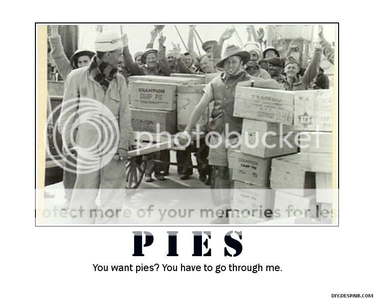
And there are pies in it as well. Champion Camp Pies.

pies.jpg
 
Upvote 0
Well, if MN (or any of the mods for that matter) needs a pen-and-pencil artist for whatever give me a buzz.

MN did get in contact with me over some drawings months back but i believe there was some confusion and the situation trailed into nothing.


Some of my work:

General drawings (just done in my spare time mind, nothing professional)

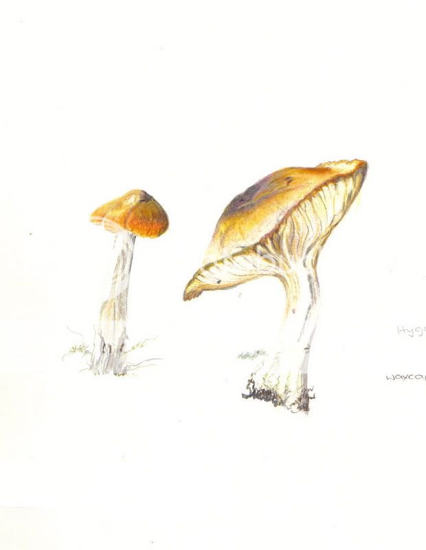
"shrooms!"
mushy.jpg


mushroom.jpg


mush2.jpg


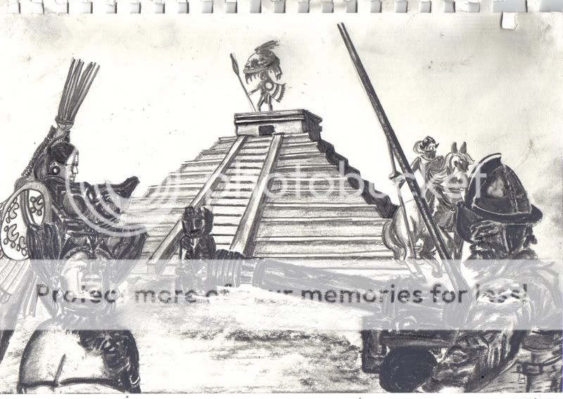
"Aztec thing...Didn't turn out too well"

AztecLoadingScreen2.jpg
 
Upvote 0
joomla :rolleyes:
the disease is spreading...

Go design a better PHP-based CMS then give it away for free... then tell us all about Joomla, Mr W. ;)

Using 1.0.13 has helped so many people get decent webbies up that you can't really fault it and 1.5 (apart from this BS about what actually constitutes a Release Candidate) looks like it will soon be even better.

Yes, I know Rails is OK but there do not appear to be enough innovative designs out there for Ruby etc. to show what it can do.

as for drupal..... fuggedaboutit, mambo... got left behind, nuke....erm, what's nuke again?
 
Upvote 0
Go design a better PHP-based CMS then give it away for free... then tell us all about Joomla, Mr W. ;)

well, in my book one page overloaded with functionality it doesnt need, be it cause of unqualified admins or un-modular design is never a good thing, beside most Joomla pages look the same.

And well, "decent" i think thats a matter of opinion there. ;)
 
Upvote 0
To be honest with you the new page looks sh*ty like some random blog you stumble over because google took you there and the only thing you want to do is LEAVE.

The old design was also more artistic.

And the poll is redundant ;)

Old site was **** if you ask me. It looked like it was designed for 800x600 displays.
 
Upvote 0
well, in my book one page overloaded with functionality it doesnt need, be it cause of unqualified admins or un-modular design is never a good thing, beside most Joomla pages look the same.

The functionality of any page of a site run on a CMS is determined by the admin - if it doesn't need it and it is there, it is the admin's fault for not removing it. You can tell Joomla which pages a certain module should appear on.

BTW - I am not saying this is the case with MN's webbie.
 
Upvote 0
The functionality of any page of a site run on a CMS is determined by the admin - if it doesn't need it and it is there, it is the admin's fault for not removing it. You can tell Joomla which pages a certain module should appear on.

BTW - I am not saying this is the case with MN's webbie.

and yet so many admins fail to even remember the simple 7+-2 rule :rolleyes:

ah well, enough offtopic, im also not judging the MN site here, each to his own ;)
 
Upvote 0
Personally the "clean and cut" look is what I was looking for. I dont want some overlycolourful cluttered piece of crap which most websites end up turning into. Also from having experimented with various colour themes its almost impossible to find one that looks good due to the fact that almost all shades of yellow look horrible and sickly on webpages in large amounts.
 
Upvote 0