Again, I wasn't talking about the design of the box art. All I'm saying is that
REAL photographs or (digital) art look much better than renders. I think we can all agree on that.
About the box art...
So a soldier on the front cover instantly means generic and boring POS? That is simply not true. You can have a soldier on the cover and still have an artistic design. And like it or not, those BF pics are actually pretty good designs.
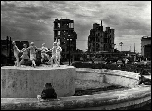
Some of you keep mentioning that you want 'artsy and mysterious' designs but what do you mean by that? Miro's design? Sorry, but that doesn't speak to the imagination at all (I know that Miro's a good designer though). You can't expect the average consumer to recognize the skyline of Stalingrad, and even then, a picture of bunch of ruins draped in depressive colours is not very attractive at all. It doesn't really show what RO is about either. Just a lot of brown and black.
If you want artsy, look at this pic. Lots of pictures of soldiers, yet still very artistic and far from generic:
More here.
The reason why it's good to have depictions of German and Soviet soldiers on the PR art is because, well, RO2 is a first person shooter. It's a war game. RO2 is not a unique snowflake in that regard. People are drawn to pictures of people. It's in our nature.
As for period photographs, that's also a possibility, as long as TWI can find high-resolution versions of the good ones. Combat photographs are often of poor quality and low resolution though. I liked the picture that TWI used in the press kit, the one with the Soviet soldiers crawling through a trench. The cover of RO's special edition is a good one as well, I agree. But yeah, it would look much better without the sniper.

I'm sure TWI will come up with a great cover.