• Please make sure you are familiar with the forum rules. You can find them here: https://forums.tripwireinteractive.com/index.php?threads/forum-rules.2334636/

Studio photographs for promo art

Nimsky

Grizzled Veteran
Nov 22, 2005
4,180
945
Elitist Prick Nude Beach
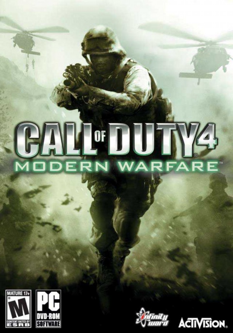
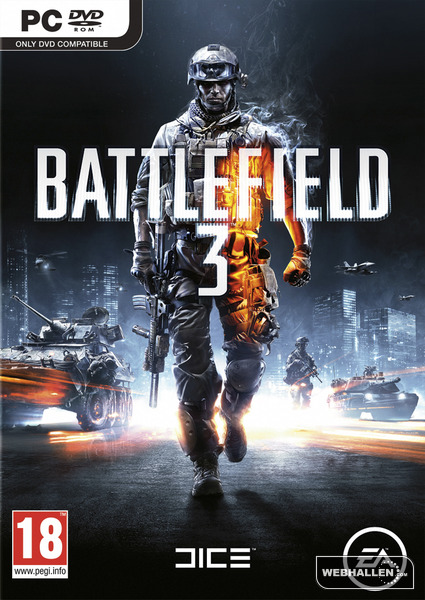
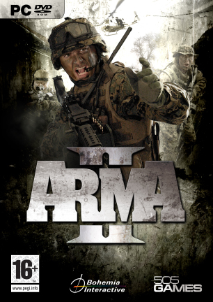
Instead of using game renders for PR and marketing, like this:

RyJ4s.jpg


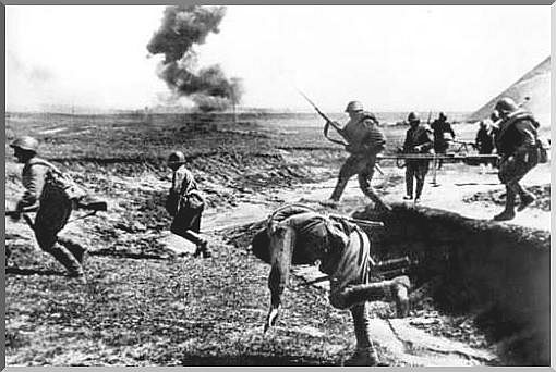
... why not use real photography, like this:

AOs4V.jpg


Or this:


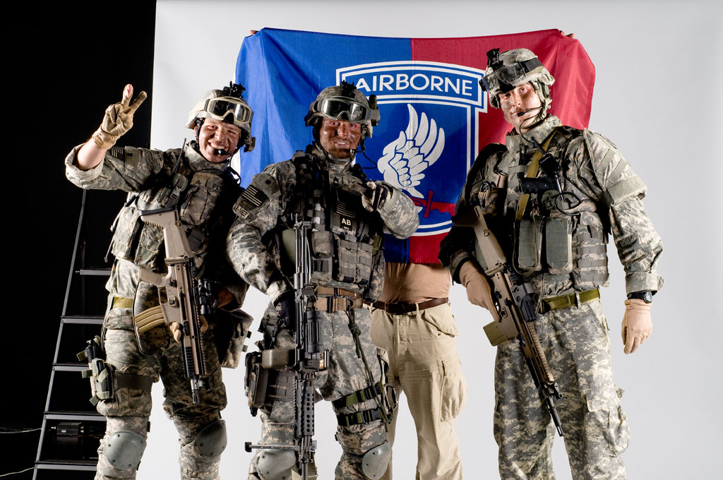
Just hoist somebody in a uniform, put him in a studio and take some nice pictures. Speaks much more to the imagination than renders, if you ask me. :)
 
I agree, although over that I much more prefer something a bit artsy and mysterious.

Like in music some times the best solo got the most empty places in it, allowing you to basically fill in the blanks for yourself.

I really like miro's boxart like this one:
rohosdvdcovertemplate.jpg

or like the original picture on the website of boats crossing the volga:
stalingrad.jpg


If I saw a cover like that I would probably look to see what sort of game it is, if the cover just showed some dudes with guns I would think its just a generic shooter and never take a look at the back.
 
Upvote 0
If I saw a cover like that I would probably look to see what sort of game it is, if the cover just showed some dudes with guns I would think its just a generic shooter and never take a look at the back.

Well, I disagree. Pictures of people catch the eye of people, generally speaking. That's why it's used so often in advertising. So I think a picture of 'real' soldiers on the cover would look good, if the design is nicely composed.

I'm not really digging the examples you posted by the way, looks a bit depressing.

Remember that pic they showed a while ago, showing German and Russian soldiers about to bump into each other round a corner? That would make a great PR shot if done with real-world models.

EDIT: I'm pretty sure this is a photograph too, looks nice.

Spoiler!


That's the kind of stuff that gets people pumped. ;)
 
Last edited:
Upvote 0
Well, I disagree. Pictures of people catch the eye of people, generally speaking. That's why it's used so often in advertising. So I think a picture of 'real' soldiers on the cover would look good, if the design is nicely composed.

Actually if you talk in generalizations, the American market prefers to have box arts that show what the game is about as much as possible in a single glance. While the European market just like to see something stand out and looks nice ensuring that people read the back of the box.

Spoiler!


When I see the modern warfare / battlefield covers (pretty much exactly the same), I immediately end up thinking that its another COD clone (heck it even puts a focus on a single soldier standing there alone like a Rambo). And if I see pictures of real soldiers I immediately think of the ArmA/OFP series.

I would much rather have an artistic representation, sure pictures can be used as a source, but the image should portray a feeling an emotion. And not just be a picture explaining the game. In my opinion the second RO boxart, was a really nice one (if they left out that darn sniper).
red-orchestra-ostfront-41-45.jpg
 
Last edited:
Upvote 0
I will look at any cover that has interesting art, The most important thing is to make it stand out, to grab atttention by being unique. Homefront did really well in this respect for its adds. but since you never see pc games in stores any more (at least in the US), I'd be more worried about what the pic for the front page steam add looks like.

I really like miro's boxart like this one:
rohosdvdcovertemplate.jpg

or like the original picture on the website of boats crossing the volga:
stalingrad.jpg

Something like these done by miro would grab your attention, being so different from the average image.

An example of Homefront's adds

homefront.png
 
Last edited:
Upvote 0
Actually if you talk in generalizations, the American market prefers to have box arts that show what the game is about as much as possible in a single glance. While the European market just like to see something stand out and looks nice ensuring that people read the back of the box.

Spoiler!

I wasn't talking about the design itself. The design can be as artistic as you want. All I'm saying is that studio photography looks much better than renders. You're right that the European designs in that pic look much better.

Also, it's not just cover design we're talking about, this stuff is important for other PR things as well.

And if I see pictures of real soldiers I immediately think of the ArmA/OFP series.

Not if it's WWII Eastern Front soldiers ;)

here some real photos (I have also higher resolution if you need)


sovietsandbagssig.jpg

(feel free to use it if you want, size is 20kb)

Nice, that's the kind of stuff I meant. :) Where did you get it?
 
Last edited:
Upvote 0
Spoiler!


Personally I have seen far too many box arts like these. What I want is a box-art that shows emotion. Be it through realistic pictures or art. A box art that is mysterious and invites me to look at the back, not a one in a dozen scenario.

The only way I'll pick up a game with a box art like those above is if I know the title is good by name.
 
Last edited:
Upvote 0
Actually if you talk in generalizations, the American market prefers to have box arts that show what the game is about as much as possible in a single glance. While the European market just like to see something stand out and looks nice ensuring that people read the back of the box.

You mean American publishers perfer having ugly box art.
 
Upvote 0
From all the pics Zetsumei posted I like the Medal of honor best... he looks relaxed and not posing like the rest.
But I totally agree that RO2 needs something better! :D

sovietsandbagssig.jpg


Nice, that's the kind of stuff I meant. :) Where did you get it?

Thanx. Its from a History doku about the Kursk battle, it was a pain to get these by capturing the screenshots... :eek:
 
Upvote 0
You are right about photos looking a lot better than rendered playermodels Nimsky, but even so, i'm with Zets on this one, i think something a little more esoteric and mysterious would be a lot better.

That one Miro did is barking up the right tree, though it's a little off message (to many planes, it allmost makes it look like it should be the art for a flightsim, and thouse look like B17's which would be the wrong front).


Another interesting approach could be to make it very stylized, and make something that looks like period Soviet propaganda posters (why not German ones? because thouse mostly sucked, and often had.. unfortunate undertones), that would definately stand out.
 
Upvote 0
Definitely agree with Zetsumei here. Something "artsy" is what I'd like to see as well.

Tho I gotta say, as long as they don't go with anything remotely similar to the following, I'll be happy.

EDIT: I'm pretty sure this is a photograph too, looks nice.

Spoiler!


That's the kind of stuff that gets people pumped. ;)
Maybe it does get some people pumped, to me that just screams generic, boring and overdone.

Edit:
Also, this:

Spoiler!
 
Last edited:
Upvote 0
I agree, although over that I much more prefer something a bit artsy and mysterious.

Like in music some times the best solo got the most empty places in it, allowing you to basically fill in the blanks for yourself.

I really like miro's boxart like this one:
http://a.imageshack.us/img844/3339/rohosdvdcovertemplate.jpg[/img[/QUOTE]

Wow. This would make me buy the game just because of amazing this looks. Simply amazing cover. Would make me keep the case even.
 
Upvote 0
yes box art is important, but i think most people these days look on the Internet about a game before they look for it on the shelf.
I think it would be cool if twi made a few mockups and got our opinions on them. Im sure the box art will do the game justice.

Actually if you talk in generalizations, the American market prefers to have box arts that show what the game is about as much as possible in a single glance. While the European market just like to see something stand out and looks nice ensuring that people read the back of the box.

Spoiler!


amnesia is another great example of this.
I wonder which box is the north American one? :rolleyes:
I myself would rather they use the European approach.
 
Last edited:
Upvote 0