
Part 3: Map Visuals and Aesthetics
---------
This thread is about map design regarding how it looks aesthetically.
For the most part, Red Orchestra 2 nails that look and feel of a city at war aesthetically. Ruins are everywhere in Stalingrad. Fallen Fighter's open terrain is brutal, unforgiving, just like the harsh Russian Winter. On Spartanovka, the rigidly planned housing blocks attribute to the ruthless monotony of centralized planning within Communist Russia. Poetry aside, the map design in RO2 makes you feel like you are in Stalingrad. You aren't just in an FPS arena but an actual drab Soviet factory, city block, or apartment complex.
The map layout isn't placed with obviously convenient cover at every turn. Sometimes streets are wide open as they SHOULD be. No seemingly convenient random cars or barrels obviously placed with intention to be used as cover. The environment was already here and you just happen to be caught up in a fight here. Its this magic feeling that RO2 managed to capture. read up on review from PC gamer for RO2. They mention this.
Rising Storm took an opposite direction. The placement of everything seems intentional, cluttered, to give cover around every turn and inch. In fact on most maps there is a distinct lack of long range shooting compared to RO2.
Indeed most RS maps seem just random. Huts are everywhere. Straw huts. Everywhere! Placed without rhyme or reason. They are just everywhere.
Take a look at some screenshots. Are these really convincing?
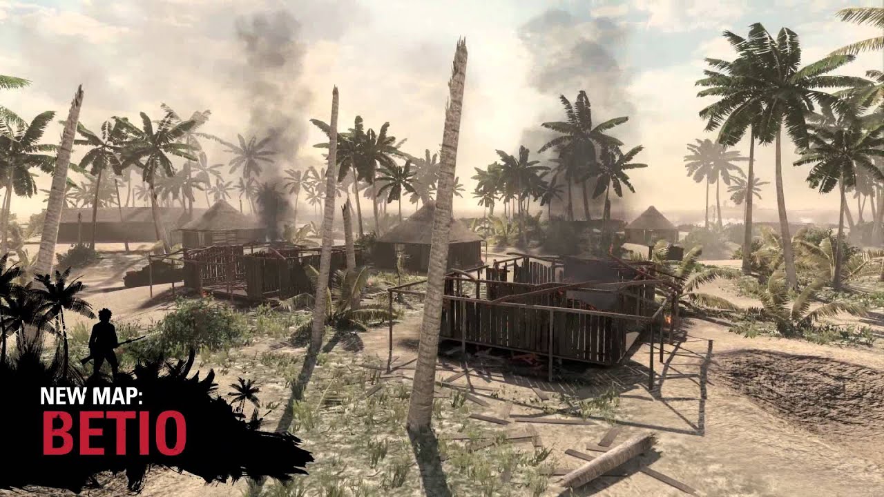
Also there is an uncanny fondness for perfectly cylindrical logs neatly placed everywhere as well.

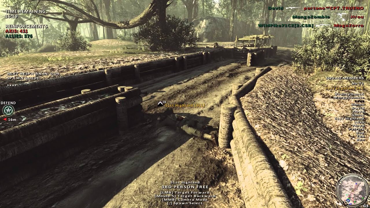
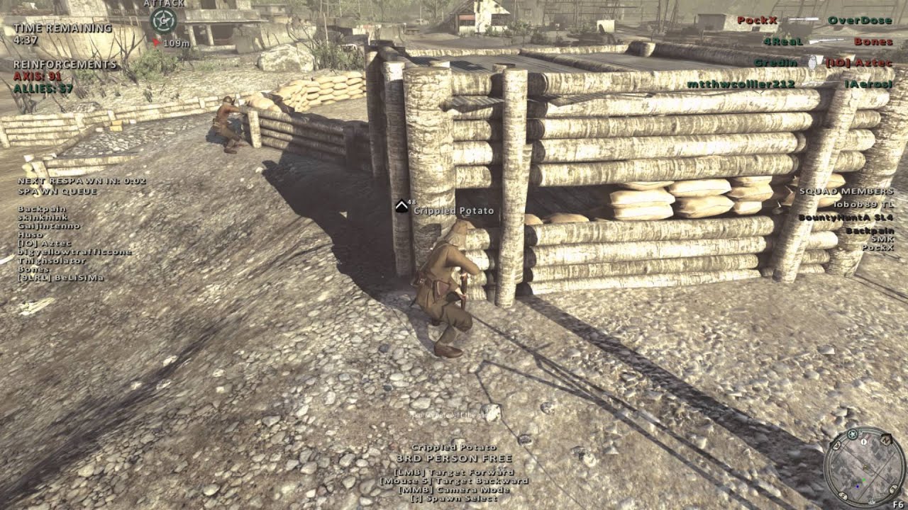

All these arbitrarily placed huts, all these clean-cut fortifications everywhere and perfect logs, repetitive elements, all this uniformly distributed cover makes the environment feel fake and not real.
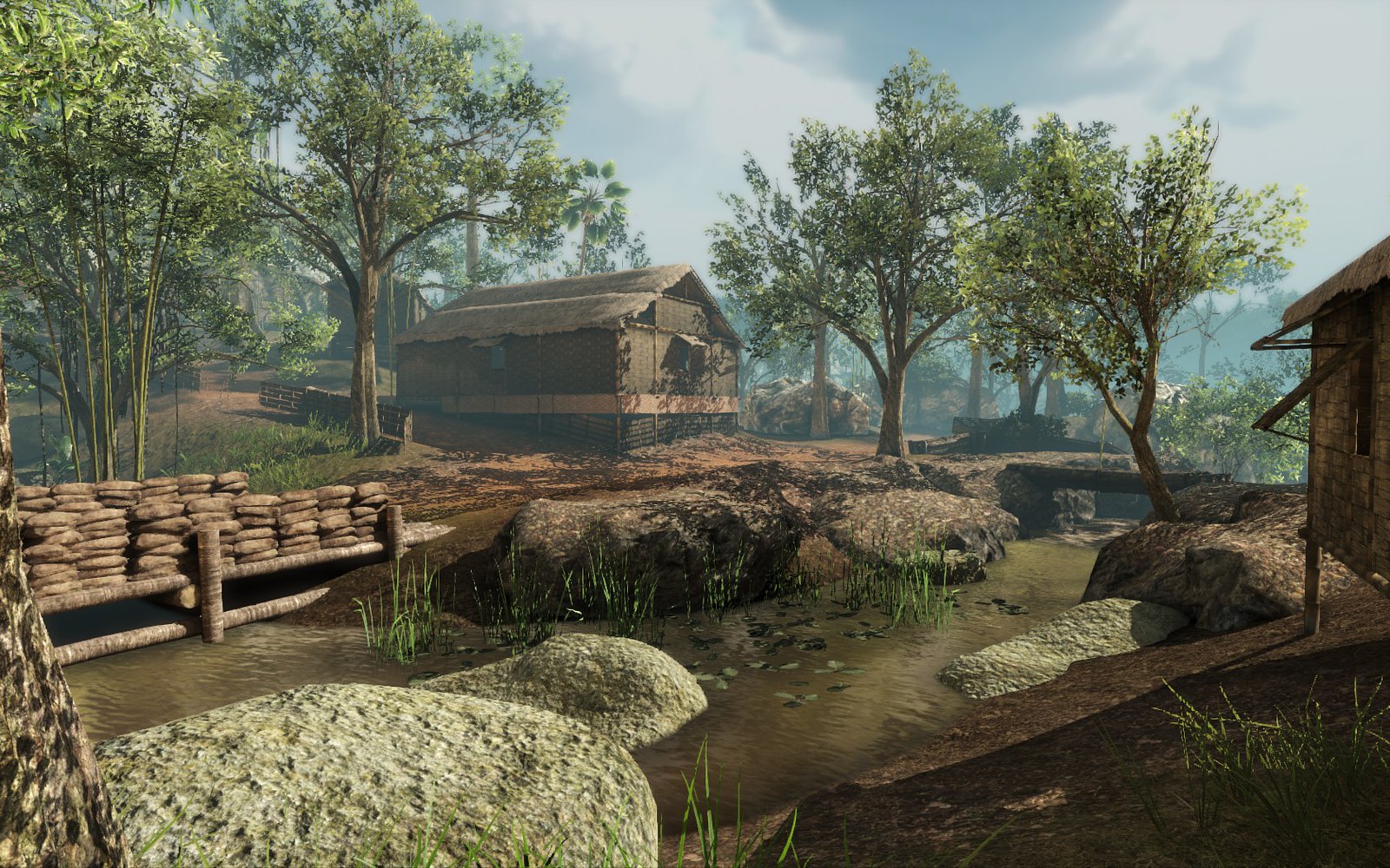
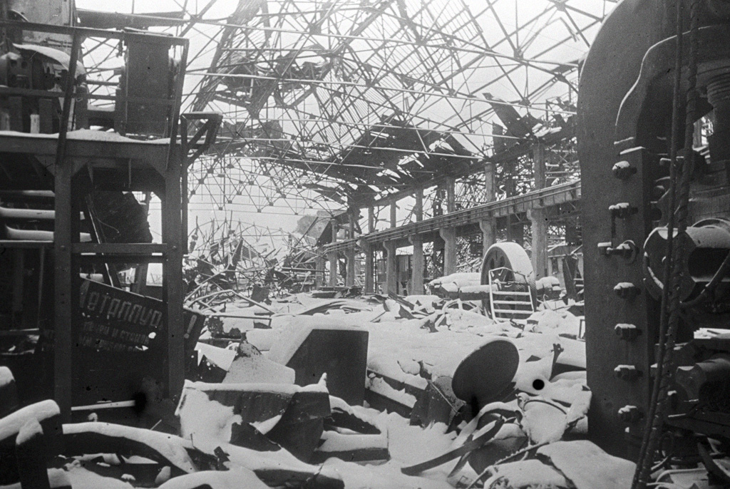
Now look at Red Orchestra 2 in contrast:

Rising Storm needs to get away from trying to uniformly distribute points of interest and cover everywhere. I like the urban environment showcased in the new trailer; however, all of the other environments shown have me disappointed that its more of the same old in RS1 with its glaring flaws.
Take a look at the new trailer 30 seconds in. We have a another smattering of random huts surrounded by jungle. Nothing else. We go from cluttered jungle to cluttered huts back to cluttered jungle on the other side. Nothing else. The soldiers happen to cross another perfect log bridge which looks out of place and way too neat.
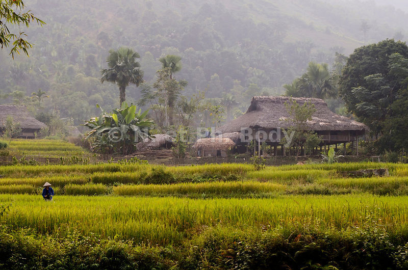
Take a look at a picture of an actual Vietnamese village:
What you will notice is that most villages tend to be surrounded by a bit of farmland. Even if jungle is nearby, at least some space is clear-cut for crops or livestock grazing. I don't think the RS developers have successfully managed to capture an authentic look for these tiny villages they always create.
In that environment they showcased, the jungle needs to be cleared at least on one side for 50 or so meters. Let the open fields have almost no cover so some long distance firefights develop. Let other approaches be jungle to advance in. Some variation is needed. Get rid of the odd log bridge platforms and barricades that are overused on most maps. Replace it with a more believable dirt road like this:

As of now it seems all the maps in RS1 have been designed with uniform clutter everywhere. It needs to be less even. Changes like these would go a long away and provide gameplay variation in the process.
Anyone agree with me?
Previously: Part 2: Voice Acting Improvements
---------
This thread is about map design regarding how it looks aesthetically.
For the most part, Red Orchestra 2 nails that look and feel of a city at war aesthetically. Ruins are everywhere in Stalingrad. Fallen Fighter's open terrain is brutal, unforgiving, just like the harsh Russian Winter. On Spartanovka, the rigidly planned housing blocks attribute to the ruthless monotony of centralized planning within Communist Russia. Poetry aside, the map design in RO2 makes you feel like you are in Stalingrad. You aren't just in an FPS arena but an actual drab Soviet factory, city block, or apartment complex.
The map layout isn't placed with obviously convenient cover at every turn. Sometimes streets are wide open as they SHOULD be. No seemingly convenient random cars or barrels obviously placed with intention to be used as cover. The environment was already here and you just happen to be caught up in a fight here. Its this magic feeling that RO2 managed to capture. read up on review from PC gamer for RO2. They mention this.
Rising Storm took an opposite direction. The placement of everything seems intentional, cluttered, to give cover around every turn and inch. In fact on most maps there is a distinct lack of long range shooting compared to RO2.
Indeed most RS maps seem just random. Huts are everywhere. Straw huts. Everywhere! Placed without rhyme or reason. They are just everywhere.
Take a look at some screenshots. Are these really convincing?
Spoiler!
Also there is an uncanny fondness for perfectly cylindrical logs neatly placed everywhere as well.
Spoiler!
All these arbitrarily placed huts, all these clean-cut fortifications everywhere and perfect logs, repetitive elements, all this uniformly distributed cover makes the environment feel fake and not real.
Now look at Red Orchestra 2 in contrast:
Spoiler!
Rising Storm needs to get away from trying to uniformly distribute points of interest and cover everywhere. I like the urban environment showcased in the new trailer; however, all of the other environments shown have me disappointed that its more of the same old in RS1 with its glaring flaws.
Take a look at the new trailer 30 seconds in. We have a another smattering of random huts surrounded by jungle. Nothing else. We go from cluttered jungle to cluttered huts back to cluttered jungle on the other side. Nothing else. The soldiers happen to cross another perfect log bridge which looks out of place and way too neat.
Take a look at a picture of an actual Vietnamese village:
What you will notice is that most villages tend to be surrounded by a bit of farmland. Even if jungle is nearby, at least some space is clear-cut for crops or livestock grazing. I don't think the RS developers have successfully managed to capture an authentic look for these tiny villages they always create.
In that environment they showcased, the jungle needs to be cleared at least on one side for 50 or so meters. Let the open fields have almost no cover so some long distance firefights develop. Let other approaches be jungle to advance in. Some variation is needed. Get rid of the odd log bridge platforms and barricades that are overused on most maps. Replace it with a more believable dirt road like this:
As of now it seems all the maps in RS1 have been designed with uniform clutter everywhere. It needs to be less even. Changes like these would go a long away and provide gameplay variation in the process.
Anyone agree with me?
Previously: Part 2: Voice Acting Improvements
Last edited:
")
