

uhh, is that method of displaying Perk Stats really any better than current? i would have to insist not - you've crammed text into these short boxes that has some of them breaking into new lines.
how exactly, is that supposed to be better than basically a two Column table with Stats on the left/right and enough space for full descriptions after that/before that (what the game has currently)? again i would have to insist it just isn't.
like, how is that better than this?
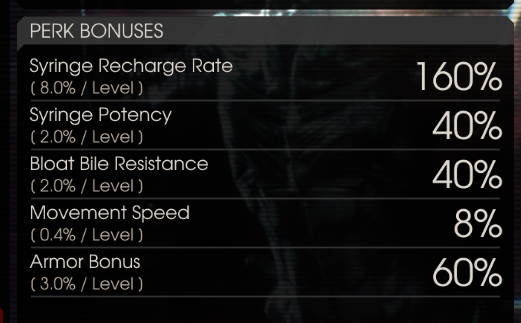
it's not any faster to read (probably slower even), and it looks disorganized too.
i assume the idea is to let the text be larger for higher Resolution displays - but if you move the 'XP Objectives' area up out of the way, why not just expand the 'Perk Bonuses' area to fill the entire region to let you use larger text without changing the way it's displayed?
how exactly, is that supposed to be better than basically a two Column table with Stats on the left/right and enough space for full descriptions after that/before that (what the game has currently)? again i would have to insist it just isn't.
like, how is that better than this?
it's not any faster to read (probably slower even), and it looks disorganized too.
i assume the idea is to let the text be larger for higher Resolution displays - but if you move the 'XP Objectives' area up out of the way, why not just expand the 'Perk Bonuses' area to fill the entire region to let you use larger text without changing the way it's displayed?
Upvote
0
