• Please make sure you are familiar with the forum rules. You can find them here: https://forums.tripwireinteractive.com/index.php?threads/forum-rules.2334636/

Level Design (WIP) My First KF Map

Krull0r

Grizzled Veteran
Jun 28, 2010
47
3
Kiel, Germany
Hi there, my name is Steffen and I am now on this forum

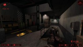
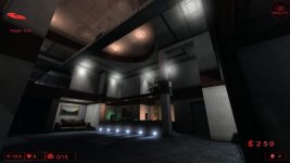
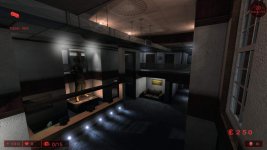
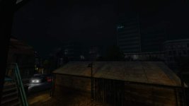
I try to build a map for Killingfloor, before I only built maps for the game Unreal 1 ( not ut99 ) so it is my first try with the Unreal Engine 2 Editor...

Some infos about the map theme:

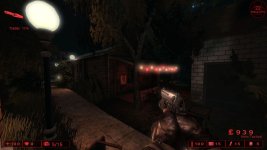
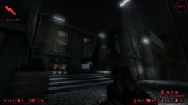
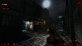
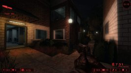
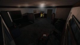
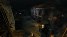
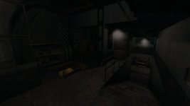
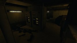
Its a City based map where you can play outdoor on the streets and indoor in some buildings. There is also a dark industiral part under the streets.


Some feedback would be nice.
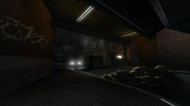
 

Attachments

  • KF-NoName01.jpg
    KF-NoName01.jpg
    36.8 KB · Views: 0
  • KF-NoName02.jpg
    KF-NoName02.jpg
    40.9 KB · Views: 0
  • KF-NoName03.jpg
    KF-NoName03.jpg
    23.3 KB · Views: 0
  • KF-NoName04.jpg
    KF-NoName04.jpg
    22.7 KB · Views: 0
  • KF-NoName05.jpg
    KF-NoName05.jpg
    30.9 KB · Views: 0
Last edited:
  • Like
Reactions: YoYoBatty
Looks very good already. Like Filthy said, nice details, good, moody looking lighting.
I would make the lights brighter though. The light-sources look like they should give off more light than they do. Or you tone down the look of the lightsources a bit. Less coronas when they're not bright and the room isn't foggy/steamy, smaller lamps if they're not supposed to shine bright and far. Maybe a bit of everything.
The big blueish street-lamp looks good, but it should light the area below it much more than what's above it. It shouldn't light what's above it much at all. I know you want it to shine up too so the roof is visible and that's fine, but you have to make it look like it shines much brighter downwards than upwards. Maybe make the current light less bright so the roof is barely lit by it and it provides a bit of ambient lighting and then add a SpotLight pointing downwards as the highlight to make the area below as bright as it is now, plus perhaps a little brighter.
The fire's lighting looks very good.
 
Last edited:
Upvote 0
hey thx for the feedback.

@ Murphy

I decided to attach the Lightactors on the Lightsourcemesh.. to give a realistic mood but your tips are really good! I will try it! thank you


@ slavek

I started to build maps for Unreal 1 in the year 1999. And I'm already building some maps for the inofficial Unreal 227 Patch. DmRetrospective which is included in the 227f patch for unreal was built by me... :)

btw.: some more tips are welcome :)
 
Upvote 0
Love the detail! The lighting in the second set of images is a big improvement over the first. My only suggestion would be to add some grunge meshes like the ones found in KF-Foundry to some places and maybe a few dead bodies. Other than that it seems like it will be a very fun map to play. Keep it up!
 
Upvote 0
Edit: And maybe I have to scale up some doors because the Zombies does block each other, and that is not good for the gameplay :)

Yes just use the X/Y Drawscale for the doors they need to be a little wider than normal

Dont forgot Also to put a SPGameInfo and a LevelRules Actor in the map

use LevelRules to increase the spawn rate to about 1.2

use SPGameInfo To Turn off the vision-overlay
 
Last edited:
Upvote 0
*Update*

Here are 5 new Screenshots =)


I think in 1 month I can release a beta version of this map.

But first I have to fix some massive FPS drains and add more gore details.
 

Attachments

  • InDoorSmall01.jpg
    InDoorSmall01.jpg
    90.8 KB · Views: 0
  • OutDoorSmall01.jpg
    OutDoorSmall01.jpg
    89.6 KB · Views: 0
  • OutDoorSmall02.jpg
    OutDoorSmall02.jpg
    70.1 KB · Views: 0
  • OutDoorSmall03.jpg
    OutDoorSmall03.jpg
    72.6 KB · Views: 0
  • OutDoorSmall04.jpg
    OutDoorSmall04.jpg
    48 KB · Views: 0
Upvote 0
This looks very good. The lighting is a work of art!

You're using very foggy looking coronas and in some places they look out of place. If the area was foggier or the light source a lot stronger maybe, but as it is they kind of look like they're just there because every light had to have a corona for some reason. If you can go over that again and decide for each one if the corona is needed or if you want to replace it with a sharper, less foggy looking one it would help the realism quite a bit, I think. Of course you can still overdo it a bit and be a little corona-happy. Style over realism and all, but toning it down to a little more realistic level wouldn't hurt, imo.
The lighting looks spot on though and I'm only pointing out the coronas because they're a weak spot to grab on to, if you know what I mean. If the rest of the lighting wasn't so good I wouldn't mention it.:)
 
Upvote 0
Nice

Nice

Very nice job so far. As mentioned the lighting is top notch. I think I see a fair amount of bloom pumped into the map too, which is used well. Great work on the geometry too, as Ive mentioned before I cannot stand bsp cut out of each other without any kind of edging to break the hard edges. Keep up the good work. :)
 
Upvote 0
Thanks for the Feedback.

@ Murphy

Can you explain with some screenshots what you mean?? :) that would help me very much.

and every tips or hints are welcome!!


Nice work! Much better than my first map. (My only map...)

hehe :) It's my first KF map, and my first try to build a map with the Unreal Engine 2.x

before that I always built maps for Unreal 1 and that since 1999 :)


btw.: is it also possible to get this map into the next KF Patch?
 
Upvote 0