
From the previews seen so far, Rising Storm 2's UI seems rather cluttered.
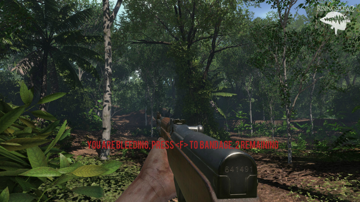
Upon bleeding, we are presented with large text message in the middle of the screen like this:
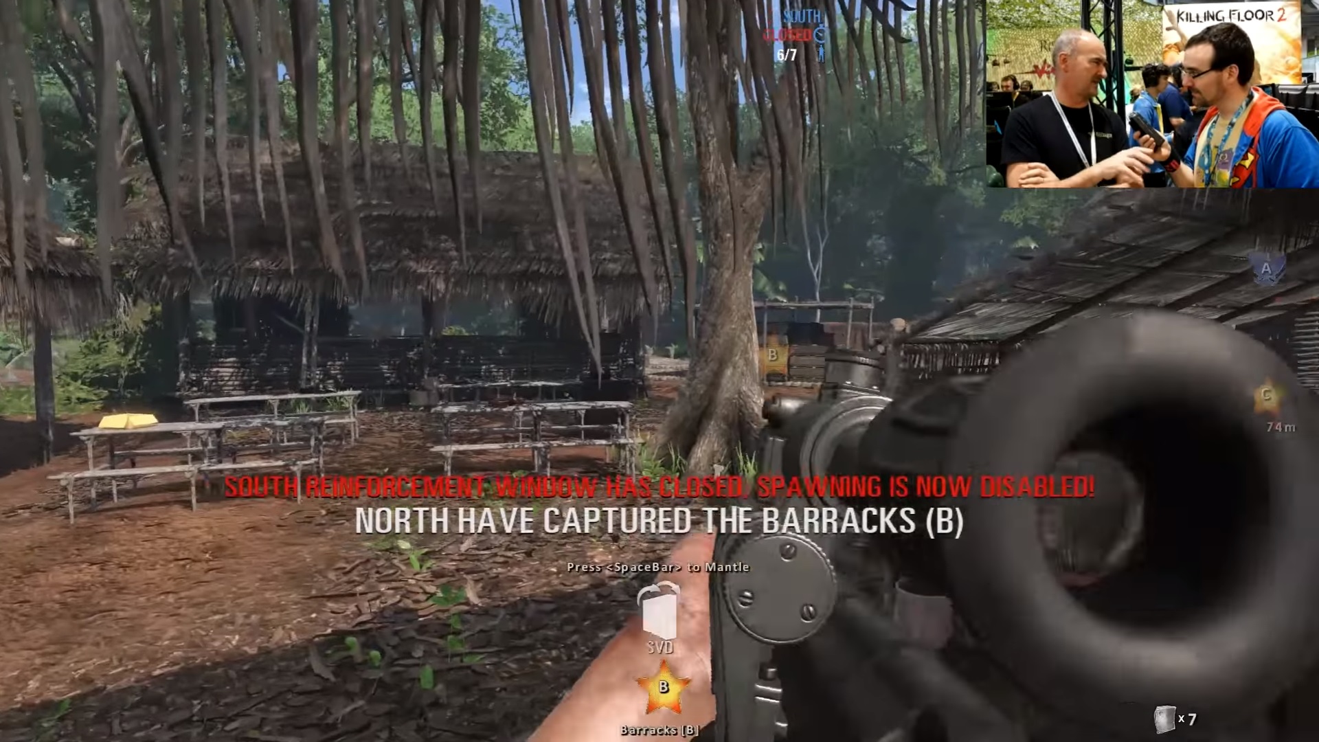
When viewing the locations of map objectives, the icons are large and tend to obscure the player's view.
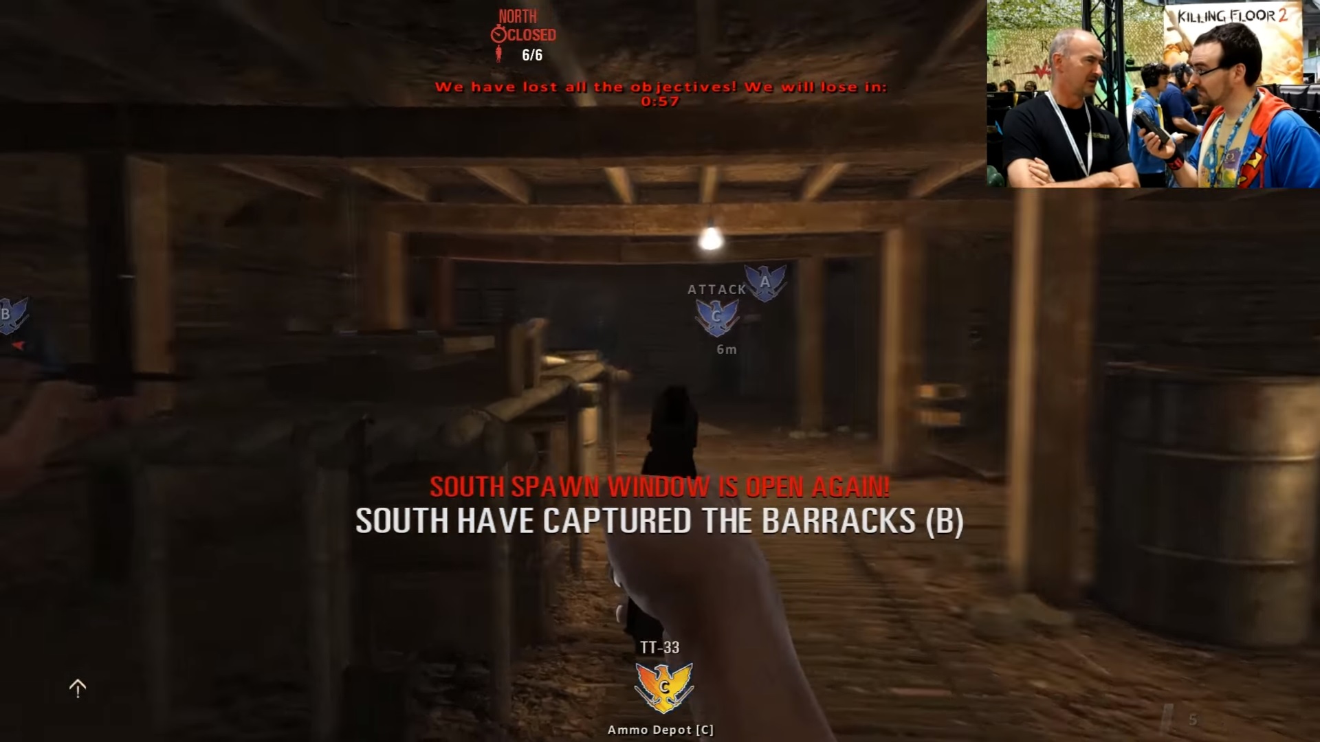
As can be seen in the following image, the bottom UI is stacked rather high into the middle of the screen.
------------------------
I made the following mockup for a new UI design that tries to reduce clutter while providing the same level of detailed information to the player.

A lot of space is saved by transitioning from the traditional circular compass to a line compass. The objective's positions can then be displayed relative to the player at all times where transparency indicates distance. A benefit is that this information is compact enough to auto-display without holding T.
The other major space saving technique is to move the capture objective icon to the top of the screen. In UI designs, more important elements tend to be located at the top and left of the screen. Following this rule, the objective letter is in the top left-hand corner of the indicator rather than the center.


Any thoughts?
Upon bleeding, we are presented with large text message in the middle of the screen like this:
Spoiler!
When viewing the locations of map objectives, the icons are large and tend to obscure the player's view.
Spoiler!
As can be seen in the following image, the bottom UI is stacked rather high into the middle of the screen.
Spoiler!
------------------------
I made the following mockup for a new UI design that tries to reduce clutter while providing the same level of detailed information to the player.
Spoiler!
A lot of space is saved by transitioning from the traditional circular compass to a line compass. The objective's positions can then be displayed relative to the player at all times where transparency indicates distance. A benefit is that this information is compact enough to auto-display without holding T.
The other major space saving technique is to move the capture objective icon to the top of the screen. In UI designs, more important elements tend to be located at the top and left of the screen. Following this rule, the objective letter is in the top left-hand corner of the indicator rather than the center.
Spoiler!
Any thoughts?
Last edited:
")