• Please make sure you are familiar with the forum rules. You can find them here: https://forums.tripwireinteractive.com/index.php?threads/forum-rules.2334636/

Box art

Susi

Grizzled Veteran
Jan 31, 2008
457
295
Finland
Red Orchestra got most uglyest cover in retail box. It look so cheap that i wouldnt had bought it, if i hadn't know whats inside it. Later made collectors editor got much better cover. How ever i fish that cover art would be something artistic with taste this time. :)

I think Brothers In Arm - Earned In Bloods is best so far, no stupid patriotism on it.
http://www.gamershell.com/static/boxart/large/10995.jpg

How ever MOH kind of heroe shots can be best for selling
http://cdon.fi/media-dynamic/images/product/001/258/1258703.jpg
 
The BiA:EiB cover is really good!

I don't know if you can get away with it nowadays, but at least back then the photo of a soldier on the cover of Operation Flashpoint was very good as well.
4093.jpg

He doesn't scream. He looks kinda friendly, but still cold and determined.
Makes me think the gameplay is methodic and tactical and the atmosphere is mostly cold-hearted but not frantic.
E.g. I could imagine the guy in the pic taking aim and shooting someone down with two shots only to move on without further thinking about his victim in any terms other than a neutralized obstacle. I could not imagine the guy shooting someone in anger or just blind-fireing somewhere.
What I can imagine the guy on the cover doing is what I think is done in the game. That's why I think this game has to be methodic and tactical with little to no emotion (whether that's how the game is or not. We are just talking about the covers here).

Here is another good one with real people on it:
2100-1.jpg

Has a certain reenactment flair to it. Doesn't make me think the game is methodical and cold like the box-art of OFP, but it also doesn't make me think the game is about all-out-action. It shows a scene that is often overlooked in other ww2 games (soldiers just travelling over the battlefield) and it seems to me like the game is made by people who are genuinely interested in ww2 for people who are interested in ww2.

It's incredibly easy to slip into b-title territory with photos of real people though.
Shockingly, almost the same pic as the first one (for almost the same game) but with a different soldier is worse already:
4097.jpg

Too angry! Makes me think that either the gameplay is more frantic than in OFP or the atmosphere is more patriotic/emotional.
I can imagine the guy taking an unaimed twitch shot at some enemy (in a movie it would look as if he was throwing the bullet at him from the rifle :)) because he is angry. I, however, can not imagine him completely blind-fireing somewhere.
Makes me think the atmosphere in the game is more emotional and the gameplay is a little more frenetic.

While the overall presentation is better, imo, the models in this pic are worse:
451072_front.jpg

It does convey a sense of companionship, but it's overdone with everyone so cramped together. It is also an action shot. Makes me think the game's atmosphere is about action and war-movie feeling and the gameplay is team-oriented but fast.

There are yet worse examples:
915040_56271_front.jpg

The guy on the right shows too much rage! Rage + aiming a gun (in a worst case scenario WITH photoshopped muzzleflash!) conveys that the game is hectic and that it is about movie-like atmosphere.
The guy on the front looks to me like he gives an honest effort to look war-torn, but it still looks like hammy acting to me so I think of the game it's as fake as the guy on the front. I.e. the atmosphere is similar to an action-war-movie and the gameplay is fast.

Interestingly those are all very realistic and tactical games for their respective genre. I didn't pick the odds ones out that were "Serious Sam goes ww2" style and took their covers here.

I hope the thoughts posted in this thread can help you pick a better box-art this time around.
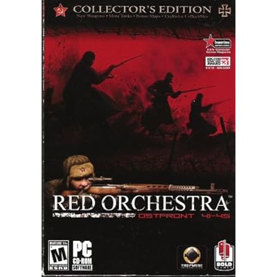
I have to agree with Susi on the cover of the first game:
It look so cheap that i wouldnt had bought it, if i hadn't know whats inside it.
It just screamed generic ww2 budget title.
 
Upvote 0
I myself think more simple yet-artistic box designs are eye catching.

Imagine for example, a solid red velvet cover with an embossed and reflective/shiny golden sickle and hammer on the front and nothing else besides at the bottom the name in it's own font and embossed golden lettering.
 
Upvote 0
I myself think more simple yet-artistic box designs are eye catching.

Imagine for example, a solid red velvet cover with an embossed and reflective/shiny golden sickle and hammer on the front and nothing else besides at the bottom the name in it's own font and embossed golden lettering.
Yes, a box should be simple and clean imho.
 
Upvote 0
I agree with Susi, I will always remember the first time my son saw a copy of the (original) box in WalMart. He said the box made the game look "cheap", and that the graphics in game were much better than shown on the package. I agreed with him, and it would be a real shame if sales were lost due to that fact. Lets face it, there are people out there who buy games based on the way they look, no sense in turning them away.

(we bought our copies off Steam and have no box)
 
Last edited:
Upvote 0
He doesn't scream. He looks kinda friendly, but still cold and determined.
Makes me think the gameplay is methodic and tactical and the atmosphere is mostly cold-hearted but not frantic.

I thought same thigs like you when watching that cover, even before i readed your comment.

I hate that kind of attitude in war movies when soldiers are pinned down, they are loosing control. Then someone lose his friend, he gets mad lose his temper, jump up and shoot every possible enemy to same stack.

Because mainly loosing your temper just means that you are dead. Screaming while shooting doesnt make you any better shooter.

So basicly dude on Flashpoint cover looks pro, considerate, determined and cold.


What goes wrong in Red Orchestra cover is that i really like drawn pictures.
But this one remind me about avrage 60's war movies. When there
was like too much movies and only few of theme were good like The Great Escape.

Example image of worst cover of worst Movie of 60's
p263.jpg
 
Upvote 0
What did the special edition version look like? The red one with the charging Russian soldiers? Does anyone have a pic of it?

How about a cover art contest? :D Saves TWI money too. :p

BTW Murphy, I also really like OFP's box art. It's classic. I also like the ones of the expansion packs, but Cold War Crisis' art is the best.

51j2ghtqmNL._SS400_.jpg


And i want to disagree with this pic sucking as a poster:p
 
Upvote 0
foR me, the best bet for the new game cover would be a montage based on German + Russian war propoganda posters.

Now im thinking about it, phaps even a 2-sided reversible cover, a la Black and white (and red alert 3 too?) , where you could display either the russian or the german copy so to speak, with either side strongly influenced (if not necessarily replicating) the propoganda art of each nation.
 
Upvote 0