
You are using an out of date browser. It may not display this or other websites correctly.
You should upgrade or use an alternative browser.
You should upgrade or use an alternative browser.
Wip forum upgrade
- Thread starter NorthDumpling
- Start date
Make some icons a bit bigger, like the talk / chat icon so it is easier on the eyes. Fonts slightly bigger for sub forum title.
Upvote
0
So it was nice for mobile briefly, but now I'm back to zooming way in to be able to poke the tiny buttons to read the first new post. Whatever you did before was great.
Upvote
0
Hmm some of the forums didn't update properly to see the latest news / comments or is it just me? 
Upvote
0
The theme is a real mess, it doesn't show the same on this page http://forums.tripwireinteractive.com/forum or this page http://forums.tripwireinteractive.com/
Really I don't like it.
Really I don't like it.
Upvote
0
[WIP Forum Upgrade] Feedback
How about some iteration on your javascript?
When you quote somebody and don't post your reply but instead press the quote button again on another post it restores the first quote instead of producing a new one. Previously it replaced the first quote (the entire template of your reply actually) with the new quote but in an ideal world it would put the second quote under the the first (or wherever your curser was).
Also, clicking a thread doesn't anker you to the first unread reply anymore.
Please pardon our mess as we continue to iterate on the forum style, css and images. If you have any suggestions be sure to let us know in the off topic part of the forum!
How about some iteration on your javascript?
When you quote somebody and don't post your reply but instead press the quote button again on another post it restores the first quote instead of producing a new one. Previously it replaced the first quote (the entire template of your reply actually) with the new quote but in an ideal world it would put the second quote under the the first (or wherever your curser was).
Also, clicking a thread doesn't anker you to the first unread reply anymore.
Last edited:
Upvote
0
A couple of things:
- There are several spots where the white text is put against a white background. Post preview is one of them (also notice the code tag):
Spoiler!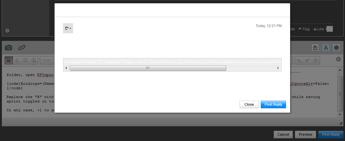
This is also an issue in the user settings panel. - I prefer the plain-text editor. But clicking on the source button in the toolbar (first button) disables all of the other formatting tools. The older forum version allowed you to insert the tags when editing in plain-text.
Upvote
0
Here is a frame animation to show a few simple modification for a nicer style: http://gifmaker.cc/PlayFrameAnimatio...M4e8SqgaF4UpMe
Current style:
 http://img15.hostingpics.net/pics/607805nook2.png
 http://img15.hostingpics.net/pics/540960nookkopi.png
Simply modified style:
 http://img15.hostingpics.net/pics/47851433ok.png
 http://img15.hostingpics.net/pics/796536ok2.png
PS: unreadable text in reply box (when it says it has previously saved the message and you have a link to restore or discard), in alert popup boxes (like when you open the image upload thing and try to post a message without uploading an image it alerts you to upload at least one image). The PREVIEW box when you click on Preview button has different background color, text is unreadable,
does not work
Current style:
 http://img15.hostingpics.net/pics/607805nook2.png
 http://img15.hostingpics.net/pics/540960nookkopi.png
Simply modified style:
 http://img15.hostingpics.net/pics/47851433ok.png
 http://img15.hostingpics.net/pics/796536ok2.png
PS: unreadable text in reply box (when it says it has previously saved the message and you have a link to restore or discard), in alert popup boxes (like when you open the image upload thing and try to post a message without uploading an image it alerts you to upload at least one image). The PREVIEW box when you click on Preview button has different background color, text is unreadable,
Code:
block has white background like others [CODE]code
HTML:
html
PHP:
php
Last edited:
Upvote
0
Thanks everybody, we are continuing to iterate and hope to have this wrapped up before next week.
Upvote
0
Is there any possibility to edit signature with BBCode? or has it been changed to something else?
Upvote
0
The messaging system is unreadable, click on 'message' button on top right of the page to see the problem.
Upvote
0
That may be seen as insisting, because yes it is, please bring back the "collapse forum" (and memorize it forever) functionality, because there is just too much forums and sub forums to check when only a few are interesting for me (same for everyone, pretty sure some people come here for Red Orchestra / Rising Storm ONLY, other for The Ball, others for Killing Flor 1/2 ONLY, and so on). I know a few people who talked about that the first time they came back on the new forum, sure lot of others feel the same.
With all the forums visible now I personally don't spend any more time checking every little icons in this icon fest on the main page. I just ignore everything and only check one subforum from the top of the page (and this thread, located at the other extremity of the main page).
+1 for the dev icon when a dev has posted in the thread that was nice.
//edit: also, the blue icons are not really different in colors, and that makes it not so easy to see which sub forum has new post and which doesn't. OK it's actually different, but I mean this is the kind of detail which needs to pop in your eyes without you to look for it, I spend lot of time on lot of different forums and current icons do not work well for me. Maybe make new posts icons in a different color (like yellow, orange or red for new posts, grey for no new post)?
Last edited:
Upvote
0
Got another suggestion that could turn out helpful in a couple of cases: A PM block list.
Upvote
0
Is using the latest activity button the only way to look for new posts? It just seems horrible compared to the older method on the older forums.
Upvote
0
Escadin;n2263331 said:Got another suggestion that could turn out helpful in a couple of cases: A PM block list.
There is an option to limit who can send you a pm in your user settings area. Click http://forums.tripwireinteractive.com/settings/profile to access your user settings area. Scoll down to PM Management area and select your option there.
Last edited:
Upvote
0
Almost three weeks.. and still lot of problems with the forum style. That is not really serious for a video game company (even for a personal blog but hey, this is not a big video game company forum, that is a personal blog).
Hopefully you work better on video games (don't ban me, just sympathetic troll, but I still mean what I said).
Hopefully you work better on video games (don't ban me, just sympathetic troll, but I still mean what I said).
Upvote
0
The background of message box (the pure white) is messing with the selectable lists for the Font or the Size for example. Having this white text in darker color would be great to be able to read it. andplease put that in the top priority https://www.dropbox.com/s/vvhhschlvg...50.37.png?dl=0 this is so annoying. Links are invisible before/after visiting them. and surely other stuff mentioned before.
Last edited:
Upvote
0
Still having an issue with Latest Activity, New Posts, or whatever it is being called. It is awkward. I'm sure you are also aware that when it displays, it is in no particular order, misses some new posts, and yet it still displays posts even if you mark them read.
I can't be the only one who has this issue...
I can't be the only one who has this issue...
Upvote
0