• Please make sure you are familiar with the forum rules. You can find them here: https://forums.tripwireinteractive.com/index.php?threads/forum-rules.2334636/

Thoughts on the HUD Art Style

Thoughts on the HUD Art Style

  • The current HUD is fine.

    Votes: 12 17.9%
  • Change the colors, leave all else.

    Votes: 5 7.5%
  • Redo the hud, going for a more simplistic look (sim level, similar to ARMA).

    Votes: 13 19.4%
  • Redo the hud, going for simplistic historical nuance (similar to Miro's design posted by Nimsky)

    Votes: 33 49.3%
  • Redo the hud, still going for an artistic style.

    Votes: 4 6.0%

  • Total voters
    67

Amerikaner

Senior Member
Nov 23, 2005
1,724
508
I didn't see a topic on this, sorry if there is one. In the grand scheme of things this isn't one of the biggest issues but presentation values can be extremely effective in making a game feel more immersive. So, with that in mind, I have some concerns on the current HUD we see in the footage. This could very well be placeholder stuff but since it's been showing up in videos for awhile I though't I'd address it.

First issue: Neon color
The color is overly drastic. Check out ArmA (I know I know, another ArmA comparison).

4-man-squad.jpg


The green overlay stands out perfectly fine but isn't in your face neon bright. It also does something else that serves to make the visuals look more...mature? The font is plain, simple, easy to read. The font in RO2 is going for a propaganda look which could potentially look great but when combined with the neon colors it looks like WW2 and Dystopian art had a baby. This could look better if the size of the font is lowered, the colors are subdued, and messages are put off to the side so the player always has their line of sight.

Second issue: Cartoony art style of the lower static HUD
In particular I mean the cap status bar, suppression bar, stamina bar, and mini map icons. Screenshot from the fact thread:
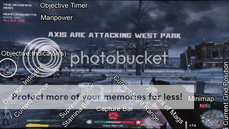
Tacticalviewexplained.jpg


The bright, basic colors combined with the cartoony art style kinda makes it look like a WW2 coloring book doesn't it? They are grabbing for too much attention. The damage indicator, current stance, and mag pouch style fit the style of the game substantially better imo. They are a simple sketch/model style that gives you the info you need without jumping out at you.

I don't mean to be harsh and this all may be placeholder. Just trying to give some feedback on my only major irk of the footage we've seen. For such an amazingly detailed game I'd hate to see it bogged down by budgety looking presentation values. (Sorry to whoever designed it ;)).

I'm not trying to present the viewpoint that only simplistic utilitarian HUDs ala ARMA are acceptable either. But the main goal of the HUD in a realism game should be to give you information and then get the hell out of your way. No fluff, no flair, just give the information as easily and nonobtrusive to the core game visuals as possible. I think this should hold true in relaxed realism, you'd just be seeing more information at once. When you go for an art style HUD it has to look very good or it can all too easily fall into the budgety camp. So with that I give you fellow fans a poll to see if I'm the only arse being concerned about this ;).

PS. Shot in the dark... I have some graphic design experience. I'd be willing to work with you on a HUD completely free of charge TWI
 
Last edited:
100% agree. The current HUD they have doesn't look good at all, IMO. Of course the game is still WIP but they've kept this look since 2009.

Also, the stance and damage indicator can easily be merged into one.

The menu screens could also use a redesign. The 'oldskool look' looks better than what they had last year but RO deserves much more class.

Something like Miro's design:

 
Upvote 0
I'd love to see a feature similar to WoW in modern FPS.

A Customizeable HUD, so you can easily adjust the size/shape and color of all Information legally avaible for the Client, though i'd guess this might come with some problems.. A Feature which is becoming quite common in MMORPGs and which would be nice-to-have in FPS.

Servers should still be able to limit the Information for the Client-HUD.
 
Upvote 0
100% agree. The current HUD they have doesn't look good at all, IMO. Of course the game is still WIP but they've kept this look since 2009.

Also, the stance and damage indicator can easily be merged into one.

The menu screens could also use a redesign. The 'oldskool look' looks better than what they had last year but RO deserves much more class.

Something like Miro's design:

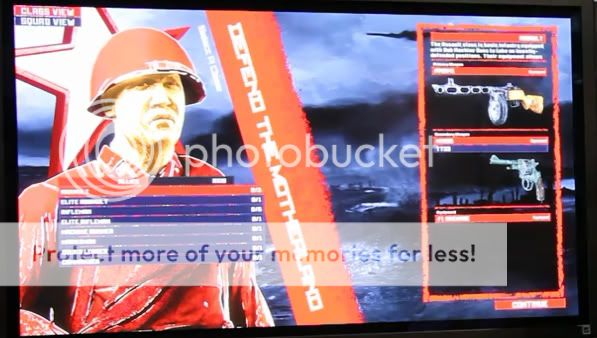
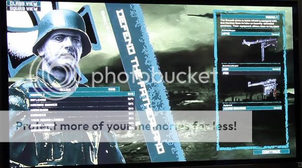
Not sure what look TWI are going with until they release and I may be the only one but I hope they keep the bold and fresh menu design seen here (below). From an artistic standpoint it looks great. However when I see a menu design like the one above I think it looks dated.

hos1.jpg

hos2.jpg

hos3.jpg


As for the actual HUD most of it will only be shown via the tactical display so size and placement shouldn't be an issue.
 
  • Like
Reactions: O'Shannon
Upvote 0
I think the colors should be toned down and the unnecessary explenation texts/icons for everything removed. For example the text "Manpower" in the capture bar can be removed and replaced with the name of the cap zone instead. The team who's capturing could be using gray or white instead of their team color while the team defending is using their team color. Or at least make that huge square telling which team is holding the objective smaller in some way.

What is the squares by the mini-map representing?

For the suppression/stamina bar I don't think it's necessary to use such a screaming color as yellow unless it's critically low. Rather have it going from Dark gray to a screamy color such as red or yellow. You want the screamy color there to make you aware that it soon will be deplenished, I don't think it will catch your I as good if it is always in a screamy color and it will be more distracting when it don't need to be.

I don't even think the suppression as many other mentioned should be represented as any bar. It's not that critical for your survival if you are suppressed compared to if you suddenly come to a halt in the middle of the road.

Want it to go in this direction:
4d7d05ed1ab40_Tacticalviewexplainedex.jpg


An idea could be to make one standard hud and one simplified without all the explanations.
 
Upvote 0
I didn't see a topic on this, sorry if there is one. In the grand scheme of things this isn't one of the biggest issues but presentation values can be extremely effective in making a game feel more immersive. So, with that in mind, I have some concerns on the current HUD we see in the footage. This could very well be placeholder stuff but since it's been showing up in videos for awhile I though't I'd address it.

First issue: Neon color
The color is overly drastic. Check out ArmA (I know I know, another ArmA comparison).

4-man-squad.jpg


The green overlay stands out perfectly fine but isn't in your face neon bright. It also does something else that serves to make the visuals look more...mature? The font is plain, simple, easy to read. The font in RO2 is going for a propaganda look which could potentially look great but when combined with the neon colors it looks like WW2 and Dystopian art had a baby. This could look better if the size of the font is lowered, the colors are subdued, and messages are put off to the side so the player always has their line of sight.

Second issue: Cartoony art style of the lower static HUD
In particular I mean the cap status bar, suppression bar, stamina bar, and mini map icons. Screenshot from the fact thread:

Tacticalviewexplained.jpg


The bright, basic colors combined with the cartoony art style kinda makes it look like a WW2 coloring book doesn't it? They are grabbing for too much attention. The damage indicator, current stance, and mag pouch style fit the style of the game substantially better imo. They are a simple sketch/model style that gives you the info you need without jumping out at you.

I don't mean to be harsh and this all may be placeholder. Just trying to give some feedback on my only major irk of the footage we've seen. For such an amazingly detailed game I'd hate to see it bogged down by budgety looking presentation values. (Sorry to whoever designed it ;)).

I'm not trying to present the viewpoint that only simplistic utilitarian HUDs ala ARMA are acceptable either. But the main goal of the HUD in a realism game should be to give you information and then get the hell out of your way. No fluff, no flair, just give the information as easily and nonobtrusive to the core game visuals as possible. I think this should hold true in relaxed realism, you'd just be seeing more information at once. When you go for an art style HUD it has to look very good or it can all too easily fall into the budgety camp. So with that I give you fellow fans a poll to see if I'm the only arse being concerned about this ;).

PS. Shot in the dark... I have some graphic design experience. I'd be willing to work with you on a HUD completely free of charge TWI

EDIT: Can only add poll options 3 min after posting thread? Damn. If a mod would allow me to do the poll, that'd be sweet.

Poll is:

Which HUD option do you prefer?

1) The current HUD is fine.
2) Change the colors, leave all else.
3) Redo the hud, going for a more simplistic look (sim level, similar to ARMA).
4) Redo the hud, going for simplistic with subtle historical nuance (similar to Miro's menu design posted below by Nimsky)
5) Redo the hud, still going for an artistic style.
Great post and I totally agree with you. The biggest issue I have with the HUD is that it has several different kinds of styles going right now, which don't work at all together. Everything else I have a beef with you explained very well already so I won't repeat it.

I also REALLY liked the old menus that we saw in the older vids, with the vivid colors. The scheme looked creative and had a very neo-WWII-propaganda look. Very cool.

As you said, all of this might be temporary, but given how long we have seen these same HUD elements in place, I think it's a good idea to have a discussion centered on them.
 
Last edited:
Upvote 0
I hope they keep the bold and fresh menu design seen here (below). From an artistic standpoint it looks great.

hos1.jpg

I disagree. It looks like something a student in his first year of graphic design would come up with, too colourful and a bit... well, tacky. (No offense to whoever designed it ;)). Especially the diagonal "Defend the motherland" bar destroys symmetry. I know that diagonal lines result in a more dynamic design but IMO Red Orchestra 2's menus deserve a classier and less chaotic style, with thinner lines and a better font, as Miro showed in his design. I studied graphic design so I do believe I know what I'm talking about (hey, about time I did...). ;)

Anyway, this thread inspired me to design a HUD of my own. View it fullscreen, please. :)


EDIT: better quality HERE. View that one please. The ImageShack in-page view isn't entirely fullscreen it seems.

Nothing fancy, just something I quickly threw together. It's what you'd see when you'd press the HUD-on-demand key. Note the use of opacity, subdued colours and a smaller and more ordinary font. That way the HUD becomes less cartoony while still being clear and good-looking. Obviously the drum mag icon would look a lot better in the final version.

I also moved the 'magazine weight' text further down as well as change the size. It would slowly fade away after each reload.

I've changed the minimap into a more realistic 'situational awareness HUD' akin to the ShackTac FireteamHud (ArmA 2 addon). Each ring represents a radius of 5m.

I got rid of the range indicator as it would be better if it only pops up if you change the range. Also note the Axis and Allied icons which are a bit more pleasing to the eye. Hammer and sickle probably wouldn't be the best idea but the point is that an icon like that looks a bit better than a simple star.

EDIT 2: obviously the cap bar and 'Axis are capturing' text would still be there if you'd let go of the on-demand key.

EDIT 3: forgot to mention that I also removed the stamina bar (can be done RO:O style) and the suppression bar (which is redundant as you already get the desaturated screen and heartbeat effect).

Thoughts?
 
Last edited:
Upvote 0
Anyway, this thread inspired me to design a HUD of my own. View it fullscreen, please. :)


EDIT: better quality HERE. View that one please. The ImageShack in-page view isn't entirely fullscreen it seems.

Nothing fancy, just something I quickly threw together. It's what you'd see when you'd press the HUD-on-demand key. Note the use of opacity, subdued colours and a smaller and more ordinary font. That way the HUD becomes less cartoony while still being clear and good-looking. Obviously the drum mag icon would look a lot better in the final version.

I also moved the 'magazine weight' text further down as well as change the size. It would slowly fade away after each reload.

I've changed the minimap into a more realistic 'situational awareness HUD' akin to the ShackTac FireteamHud (ArmA 2 addon). Each ring represents a radius of 5m.

I got rid of the range indicator as it would be better if it only pops up if you change the range. Also note the Axis and Allied icons which are a bit more pleasing to the eye. Hammer and sickle probably wouldn't be the best idea but the point is that an icon like that looks a bit better than a simple star.

EDIT 2: obviously the cap bar and 'Axis are capturing' text would still be there if you'd let go of the on-demand key.

Thoughts?
Wow, that's perfect!
 
Upvote 0
Huaaah

WAKE UP!

We have been talking about this in multiple different
threads. Offcourse the focus have been allways on
different areas of TWI visual design.

But outcome is allways same, visual design is out dated.

Their logo
895735-tripwireinteractive_logofinal_large.png

Playstations and gradient photoshop effects
arent cool anymore. And wtf is that tripwire font
below.

Did they used this as a reference?
60%20GREAT%20SCIFI%20BK.JPG


Player/weapon progress menu
mpzb.jpg


looks like
4311-2-medal-of-honor-allied-assault-spearhead.jpg

Medal Of Honor..in gods year...cant even remeber.


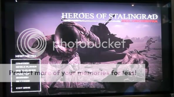
Main Menu looks allmost cool, but
menum.jpg

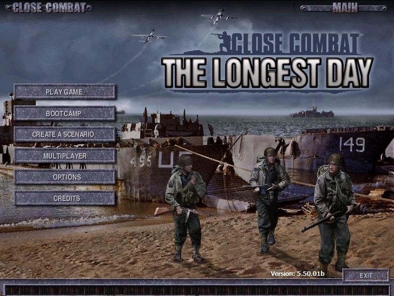
..ist that like

371050-close-combat-the-longest-day-windows-screenshot-main-menu.jpg

Close Combat 5 in year 2000. Who the heck uses buttons
in year 2011.

Ant then we come to fonts once again.

fontb.jpg


Are they aiming on scifi industry or why they use
kind of box fonts?

eventhorizon.jpg


Didnt you even take a look where you were.

gdc009.jpg


Now adays people use simple rounded fonts.


7_the_pacific_hbo_1.jpg


So noo, doing art again doesnt help as long as you dont
hire art director to doing those instead of useing
some texture artist, while he is doing some textures.
 
Upvote 0