• Please make sure you are familiar with the forum rules. You can find them here: https://forums.tripwireinteractive.com/index.php?threads/forum-rules.2334636/

Beta Map KF-Wyre Remake

Motormouth

Active member
Jun 2, 2015
27
2
Sruq6Em.jpg


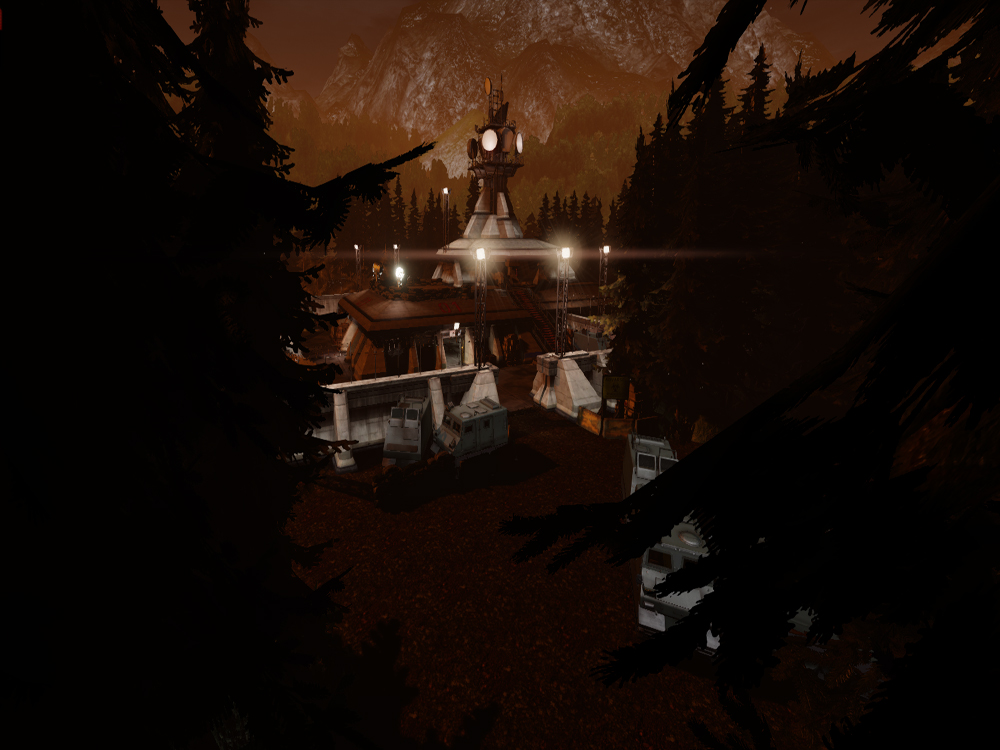
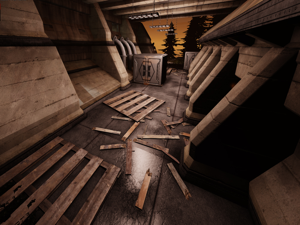
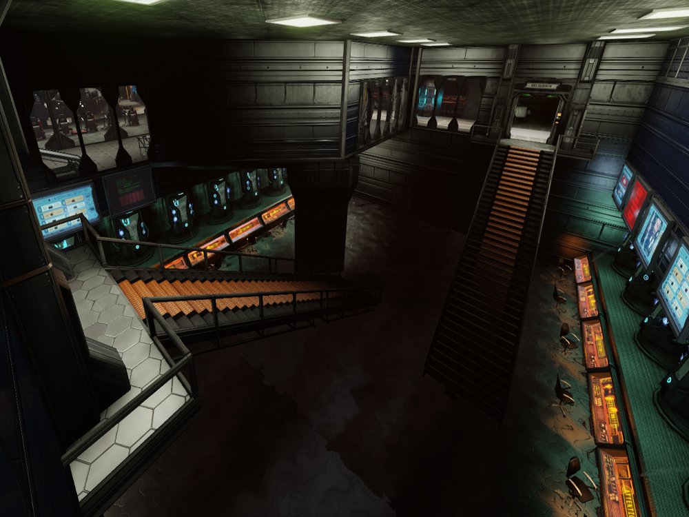
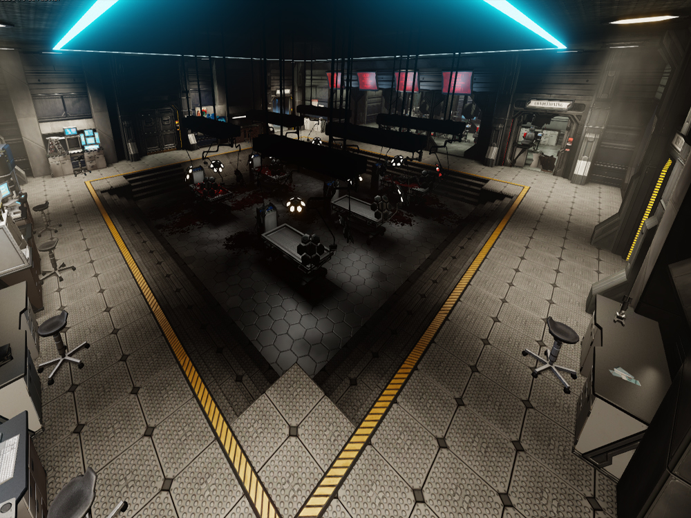
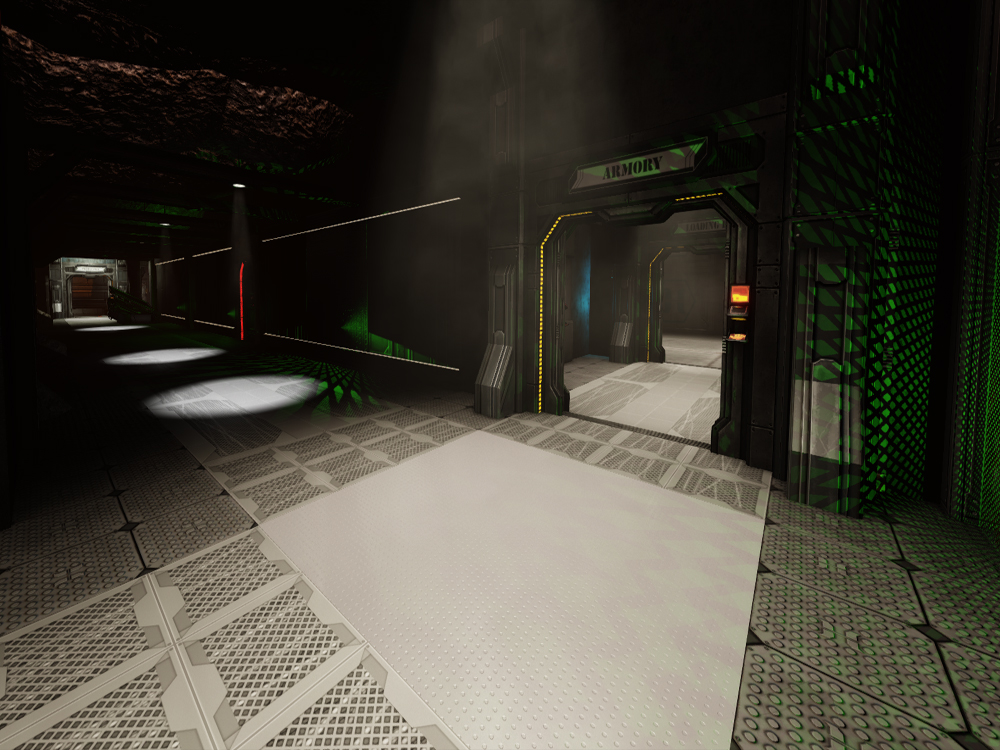
The Wyre Forest is an uneasy marriage of decaying life, and new beginnings. Remote, and isolated; it's the perfect location for unorthodox science to flourish. Beneath the rot of the forest floor, in Horzine Research Bunker 6, some brilliant minds are cultivating an army of deadly female soldiers that the enemy will never see coming...

Download Link:

http://www.mediafire.com/download/ih9yx9kfae5x4cb/KF-wyre2009_v5.rar

Updated to version 5

This is my attempt at a remake of the original Killing Floor map, Wyre Forest. I've tried to stay faithful to the design and atmosphere of the original, but I've also made a few changes here and there in places.
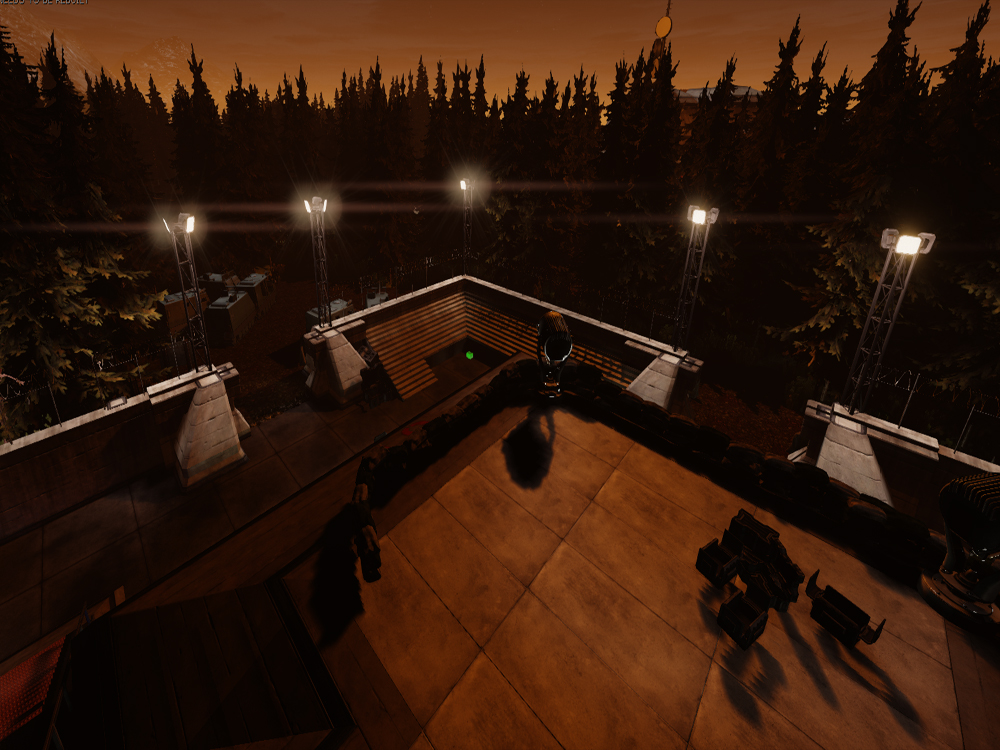
The layout is slightly adjusted to make the map more cohesive, mainly in the original docks area that I've turned into a helipad/loading bay, that area used to be quite distant to the rest of the map only reachable through a single long dark corridor or a long trek through the woods, whereas in this remake I've repositioned it much closer to the rest of the action.

As always, all feedback and criticism is appreciated, and thanks for checking out my map!

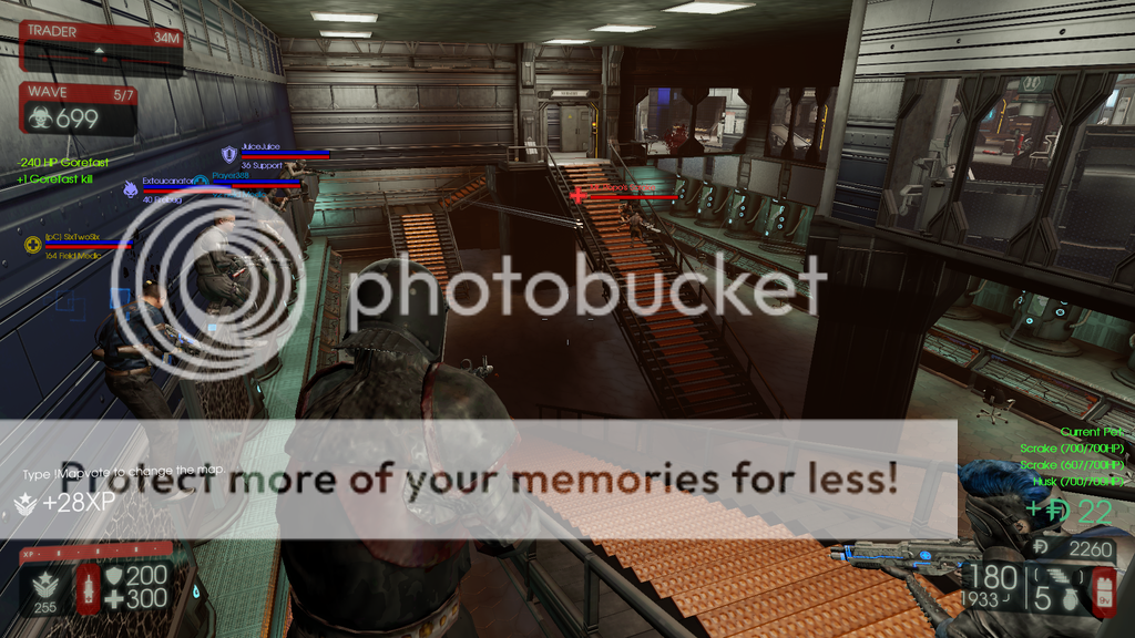
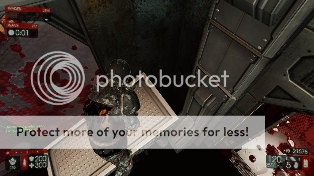
Additional screenshots:

Spoiler!
 
Last edited:
  • Like
Reactions: matrimelee
Nice idea. Are those screen shots in game or from the editor? Reason I ask is because the lighting looks way off. What happened to the hue-soaked colours of the original? The inner areas look way too bright as well.

These are just my own personal opinions of course.
It is a remake though, own visual appeal represented by creator. I guess? I mean it still looks awesome as heck.
 
Last edited:
Upvote 0
Nice idea. Are those screen shots in game or from the editor? Reason I ask is because the lighting looks way off. What happened to the hue-soaked colours of the original? The inner areas look way too bright as well.

These are just my own personal opinions of course.

I think the lighting looks awesome. The bunker is not as dark as in the original Wyre map, but if all the lights are destructible, that would push players to the forest at some point.

I will be looking forward to see how you'll make the forest it self. Doing this 'right' requires ALOT of detail and you don't want it to cause too much frame rate drop.
Keep it up, looks great. :)
 
Upvote 0
Updated to version 3, I've now done a precomputed visibility build (just over 15 hours!) so now the optimisation should be a lot better.
I've also made sure the filename of the map includes the version number so as to not cause any problems.
The feedback's been great, I appreciate it all!

FPS improved a bit (from 25 - 30 to 35 - 40) but still not overly playable, especially as frame rates would likely go down in multiplayer. It's a start but still needs some improvements before it would really be playable.
 
Upvote 0
Updated to version 4. Turns out I'd done something really stupid that was causing a lot of performance loss. Long story short, lazy lighting is bad.

Things should be a lot better now, in the stat fps command I was seeing a constant 70-80 fps, very rarely going beneath 60 at the lowest, and frequently going up to 90-100.

I'm always thankful for the feedback and the effort to give new versions a try, it's encouraging to know that people want the map to be good even if it isn't quite there yet, it's good motivation to work away and sort out the issues.
 
Upvote 0
We still have low frames, including people with really good computers.

There is another way to optimize your map. You have SO MANY static objects everywhere. Example: There is an inaccessible room with ~15 medical beds in it.

Delete lots of things like that, and go for a look of "overrun by ZEDs". 1-3 medical beds, with 1 knocked over, with some blood in the room creates the same idea you have. Only this suggestion uses a fraction of the medical beds. Which is far easier on our computers.

It's your map, and you ultimately control how it develops. But the system requirements for your map is several times higher than the base game.

We love the map, but find it difficult to play as often as other maps.
 
Upvote 0
Hmm, it feels like Wyre, it looks like Wyre, but I don't think it has the same layout as Wyre. It really confused me, were you throwing your own spin on it and not trying to be accurate?

Either way, great map! The atmosphere of Wyre is there and the map is very enjoyable, but it's different from the KF1 version.
 
Last edited:
Upvote 0
I really enjoyed the layout and feel on this map but my framerate tanked. Outside was worse. There was a very noticeable difference when I walked inside, it was like as soon as the outside wasn't visible anymore the game smoothed out. Although there are parts of the inside around certain rooms where it drops again in the later rounds with more zeds.

Maybe removing some static objects is the key, but I have never made a map myself so I don't really know :p

Great job. Looking forward to future updates
 
Upvote 0
In the description you say that you've tried to stay faithful to the original design, but personally in my opinion I'm not seeing anything close to the original at all. The layout is all wrong, the outside is completely flat as far as I can tell, and everything is too tightly close together. Not a bad map, but not exactly a remake of wyre. Oh and I haven't seen any running water outside. This isn't anywhere even close to the original. Though like I've said before, the map isn't bad. It's just not Wyre, which is disappointing.
 
Last edited:
Upvote 0