so the BETA is out,now we can talk more openly about RS2 Vietnam.
you improved the bleeding system a lot, i really like the slow fade into black when you bleed.
this way you know exactly how much time you have left,until you die. And that way you can choose: stay in the fight for a little bit longer or find a safe spot to bandage yourself.
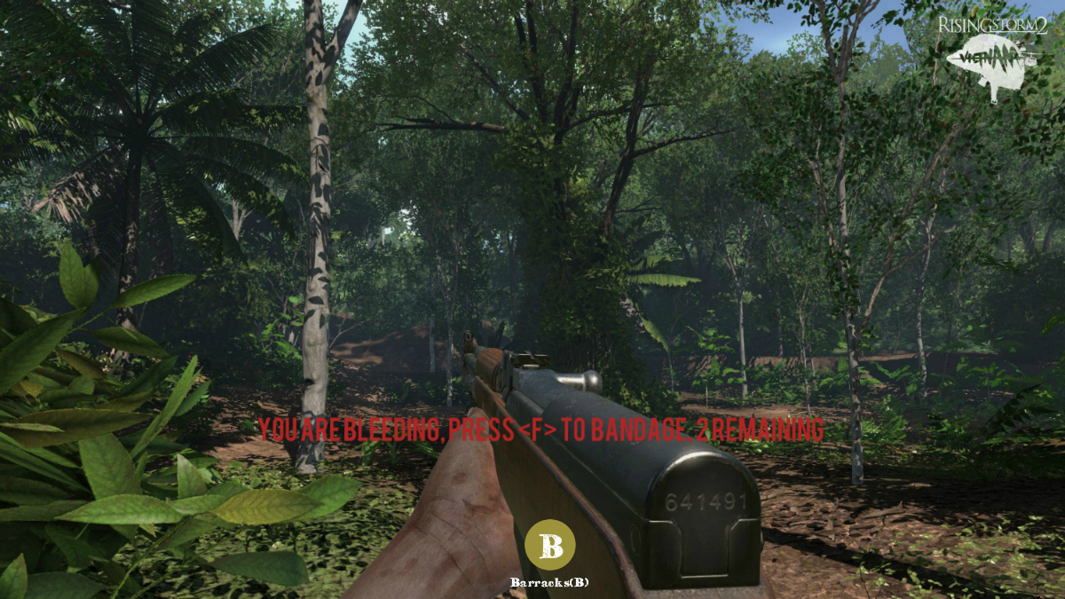
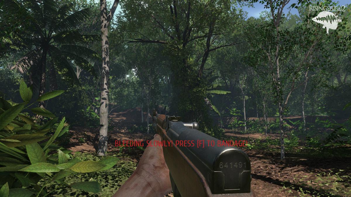
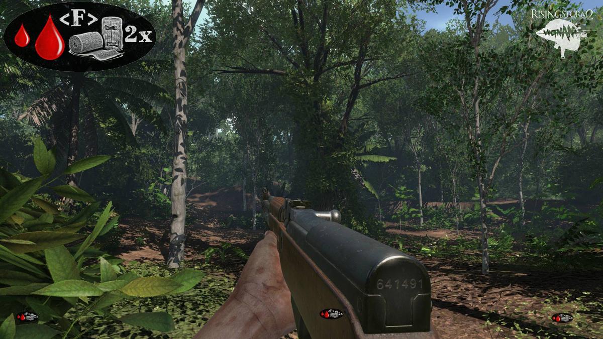
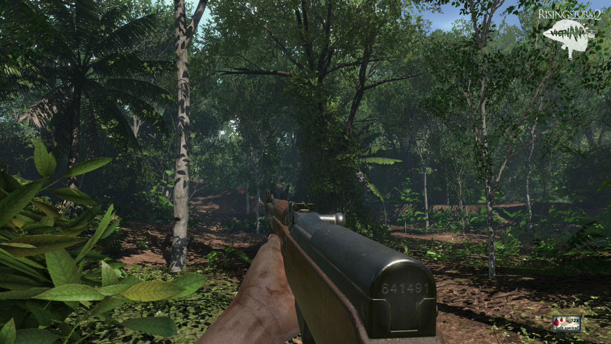
but the thing i dont like is the big text in the middle of the screen going hey :"BLEEDING SLOWLY! PRESS [F] TO BANDAGE"... it works yeah ,but it looks kinda meh... and it blocks too much of my view.
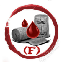
so instead of text i would like to have an icon. (even it its just a optional choice like the ammo/mag. check icon) http://imgur.com/GMQZW9K
i have something like this in mind:
a small pulsating bandage+blood drop icon on screen,that will look/work similar to this
(new improved version- Nov.23):
>>>https://giphy.com/gifs/FMTa9EN17t1m <<<
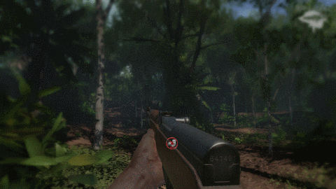
so instead of this:
​
you get something like this:

just the icon:
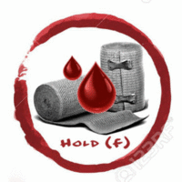
bandaging is now a "hold" (4 beta wave) system, how about a icon like this,that shows you the bandaging process?
some more concept versions:

.................................................. .................................................. .................................................. ........................
old / out of date concept versions:
b.) old (sep.17.)animated bleeding icon >>> http://imgur.com/a/c1wge
a2.)-old
a1.)old
a.)old

you improved the bleeding system a lot, i really like the slow fade into black when you bleed.
this way you know exactly how much time you have left,until you die. And that way you can choose: stay in the fight for a little bit longer or find a safe spot to bandage yourself.
but the thing i dont like is the big text in the middle of the screen going hey :"BLEEDING SLOWLY! PRESS [F] TO BANDAGE"... it works yeah ,but it looks kinda meh...
and it blocks too much of my view.so instead of text i would like to have an icon. (even it its just a optional choice like the ammo/mag. check icon) http://imgur.com/GMQZW9K
i have something like this in mind:
a small pulsating bandage+blood drop icon on screen,that will look/work similar to this
(new improved version- Nov.23):
>>>https://giphy.com/gifs/FMTa9EN17t1m <<<
so instead of this:
Spoiler!
​
you get something like this:
Spoiler!
just the icon:
bandaging is now a "hold" (4 beta wave) system, how about a icon like this,that shows you the bandaging process?
some more concept versions:
.................................................. .................................................. .................................................. ........................
old / out of date concept versions:
b.) old (sep.17.)animated bleeding icon >>> http://imgur.com/a/c1wge
a2.)-old
Spoiler!
a1.)old
Spoiler!
a.)old
Spoiler!
Last edited: