
do you like current one?
i don't
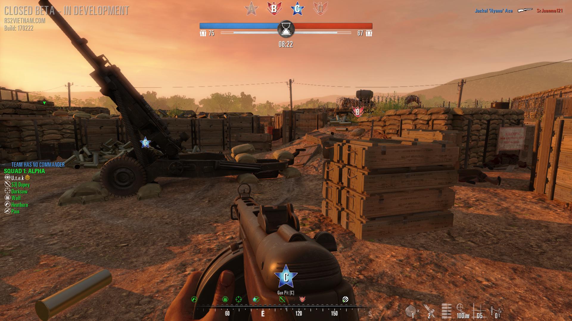
to me the objective icons and the whole HUD is kinda meh...weird looking(the bird and star),cluttered,too big and confusing.
i would like to see a more clean,minimalistic,simple look.
something like this:
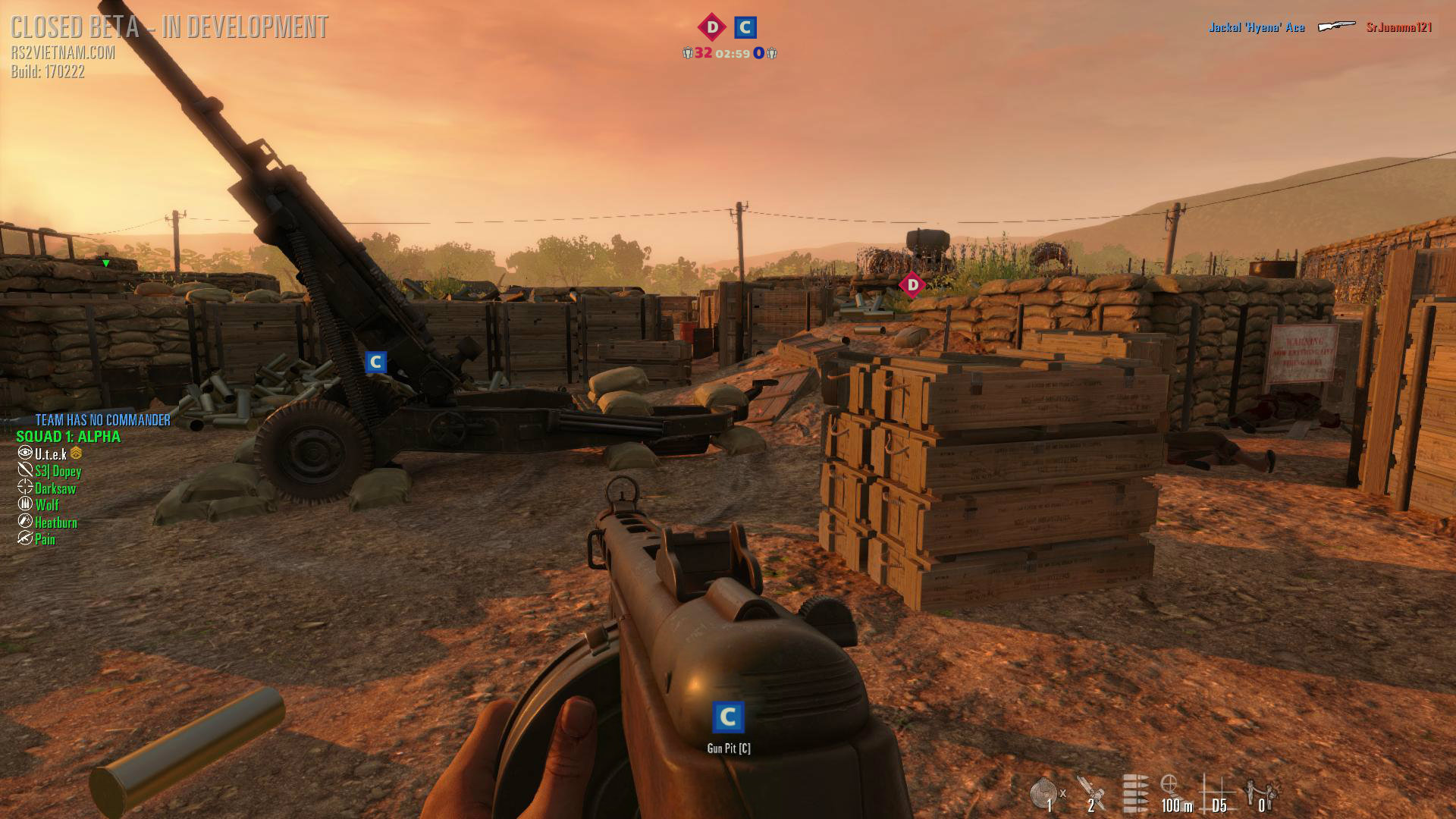
instead of this(beta5):
some more examples:
something like this - http://imgur.com/DFuzCIs
instead of this - http://imgur.com/hv0enH6
*more HUD customization options would be great to,so that you can disable stuff you don't need or want to see.
-like the compass-http://imgur.com/st4wJR7
-those huge "in your face" text pop ups messages:
"RandomPlayer joined US ARMY"
"RandomPlayer left the game"
"RandomPlayer entered the game"
"WE ARE ATTACKING OFFICE BUILDING (A)"
"ATTACKERS DEPLOYED REINFORCMENTS"
"Napalm support incoming!"
"WE ARE DEFENDING THE FINAL OBJECTIVE! DONT GIVE UP!
...
so,right now it's really hard to tell which objective is under attack,the icons blick too little. and because of the bird and star icon,it's kinda hard to tell from a distance what objective it is,..a B looks like a D, a F looks like a E, a G looks like a C...http://imgur.com/UzcQbVt
so maybe they should take/copy some things from INSURGENCY?
a short Insurgency HUD icons video : https://youtu.be/0A2HhhmSP_c?t=3m17s
(the "white arrow"-attack/defend thing is great.)
and yeah, i still want this") : http://forums.tripwireinteractive.c...d-suggestions-af/120378-icons-instead-of-text
: http://forums.tripwireinteractive.c...d-suggestions-af/120378-icons-instead-of-text
what do you think?
Utek
i don't
to me the objective icons and the whole HUD is kinda meh...weird looking(the bird and star),cluttered,too big and confusing.
i would like to see a more clean,minimalistic,simple look.
something like this:
Spoiler!
instead of this(beta5):
Spoiler!
some more examples:
something like this - http://imgur.com/DFuzCIs
instead of this - http://imgur.com/hv0enH6
*more HUD customization options would be great to,so that you can disable stuff you don't need or want to see.
-like the compass-http://imgur.com/st4wJR7
-those huge "in your face" text pop ups messages:
"RandomPlayer joined US ARMY"
"RandomPlayer left the game"
"RandomPlayer entered the game"
"WE ARE ATTACKING OFFICE BUILDING (A)"
"ATTACKERS DEPLOYED REINFORCMENTS"
"Napalm support incoming!"
"WE ARE DEFENDING THE FINAL OBJECTIVE! DONT GIVE UP!
...
so,right now it's really hard to tell which objective is under attack,the icons blick too little. and because of the bird and star icon,it's kinda hard to tell from a distance what objective it is,..a B looks like a D, a F looks like a E, a G looks like a C...http://imgur.com/UzcQbVt
so maybe they should take/copy some things from INSURGENCY?
a short Insurgency HUD icons video : https://youtu.be/0A2HhhmSP_c?t=3m17s
(the "white arrow"-attack/defend thing is great.)
and yeah, i still want this
: http://forums.tripwireinteractive.c...d-suggestions-af/120378-icons-instead-of-textwhat do you think?
Utek
